View on the game graphics Posted by Fiola on January 18, 2015 10:00 AM
Our new blogs don’t only inform you on the updates, the process and how we’re getting along with our plans on releasing BLACKHOLE. This way, we can and do show what it’s like to develop a game to the players. We hope that by doing this, we also help the players to appreciate this audiovisual piece and realize how much work precedes it.
That’s why today Tomáš Otáhal will let you in on the secrets of how putting the whole graphics together works. Because you wouldn’t really take much from the information such as ‘today we did the tile setting of standard desert levels’.
Art comes first
Any kind of graphics we can see in a game is a form of art. Graphic artist is someone who sees to it that you enjoy the visual part of the game, inspects what kinds of emotions do the scenes evoke and primarily, how will you like them. Such person is still only a human though, and can’t handle all the work alone. It’s definitely wonderful to make an art-oriented game with hand-drawn game locations, but you’ll agree with me that there are some limits.
In BLACKHOLE are about 80 different levels where the average resolution is (for example) about 3000x2000px. Just by some simple calculation you’ll find it’s about 420 million pixels to color (and we’re just talking about clear levels. We’re not counting any of our full HD 50 FPS animations, no special level for choosing levels and mainly not all big specialties, like running away from lava, in.)
Doing all of this by hand would be incredibly time consuming, and therefore we need to make our job a little easier.
What are we walking on?
I’m getting to what a "tile setter" does. A graphic doesn’t draw the whole scenery on his own; instead of that, he just puts various elements together – kind of like tiles, and thanks to them put the whole game together little by little as if it was made of cobbles.

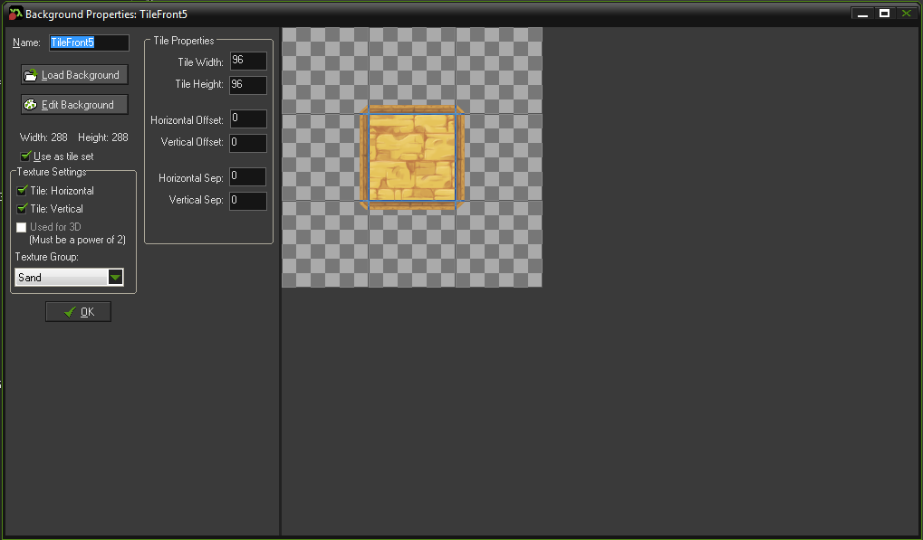
01. An example of desert’s basic element
The problem is that if we take this tile and use it to fill a certain level with, it might look a bit monotonous. We can’t say shoddily made, no. To create an element so it fits everywhere and links to other tiles is not an easy task.
We must count with position of block which can be lie from all world sides. If we take this process wrong, we’ll see all some lines, cheesy grooves and so on. So for great orientation in the environment must that, after we’re running, seem seamlessly.
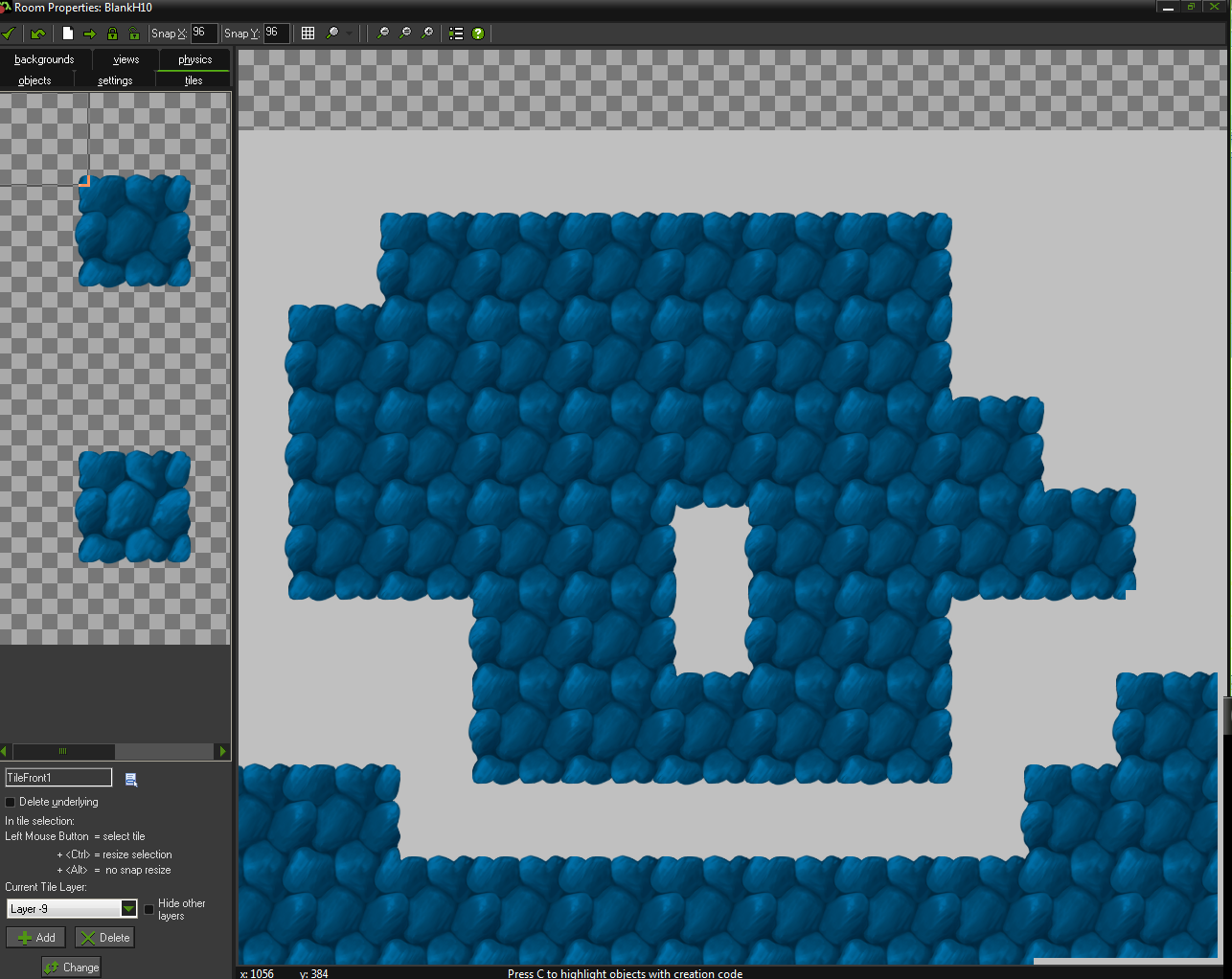
02. For the first look it’s really looks seamless. Maybe too much.
As you can see, that looks really humdrum. Even though it’s nice not to have any marginal lines, which makes the whole space nicely bordered, sadly there’s another thing to disturb us. You can clearly see that the elements repeat way too much. There’s always two stones in a row, and all the time! That sort of esthetically resembles the work of a two-year-old with a rubber stamp.
In the end, the player works out that the environment looks all the same. That’s not what we want you to think. There needs to be more!
Pattern breakers
So we need to lead the player’s focus around. Thingies called ‘pattern breakers’ are usually used for this in games like ours. How to make the player believe he’s not in a row of 20 lookalike stones? Well, it’s actually simple.
We’ll throw one different stone in. This can be explained very simply; if there’s a waterfall of A’s in a pupil’s record book, it’ll make it very boring to look over them. But it is enough to spice things up by adding something interesting, like an occasional F, and voilà, the focus is somewhere else!
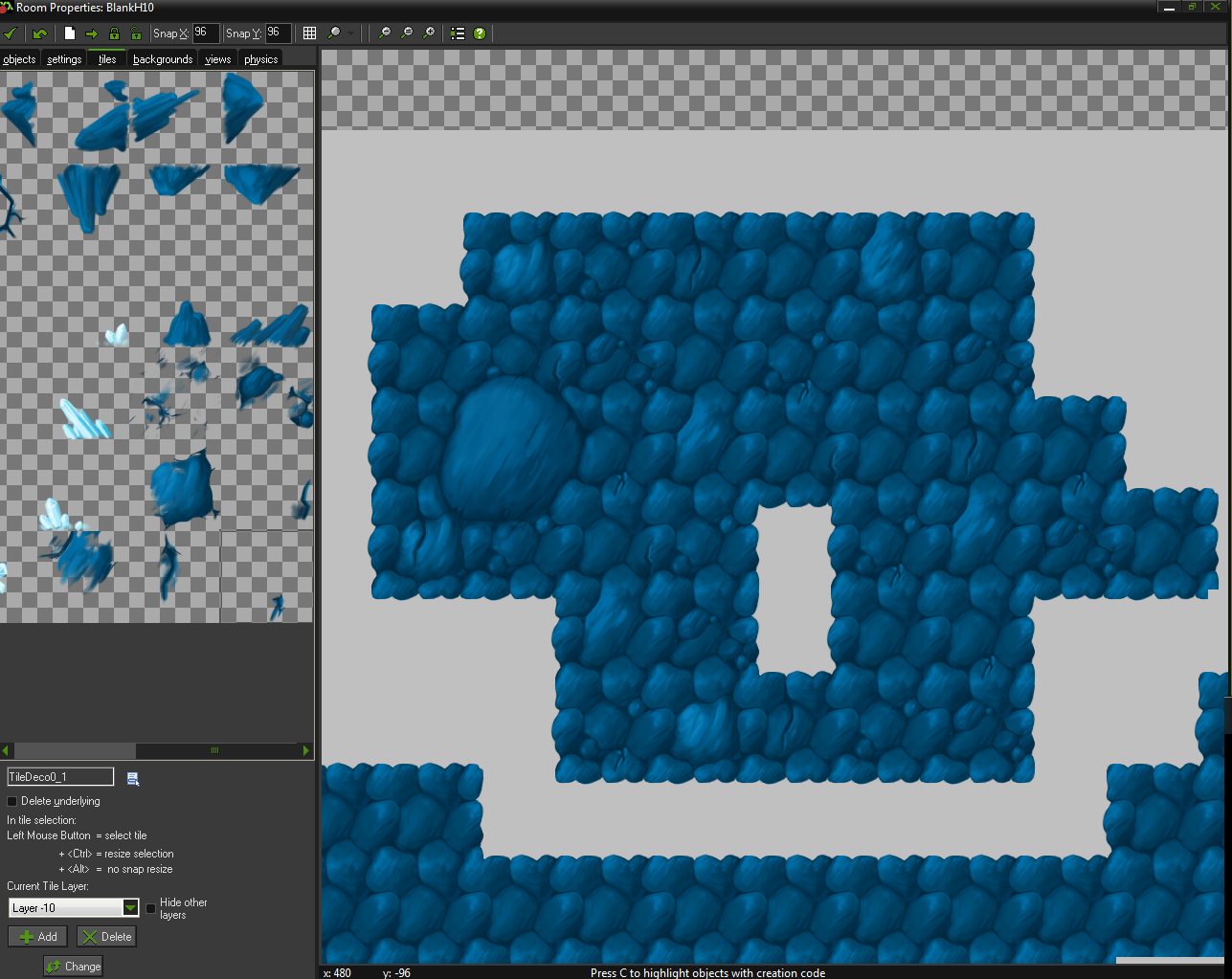
03. Adding little stones
You can spot the changes between ¨broken” parts of the space and the “unbroken” ones very easily. In fact, all we had to do was add a stone here, a crack there, split a stone in two over here and the whole scene looks much better. A great deal better and all that needed to be done was designing a few different graphic components.
However, these additions need to be placed well, too. They need to go at the exact place where they’re supposed to go. Some can’t be put on the edge of a block. Some must go exactly there. And some may be too big for a certain area. I have to admit that sometimes it can be a fiddly job. If you un-isolate a graphic layer that’s one lever closer to the eyes, you’ll see how many things there are.
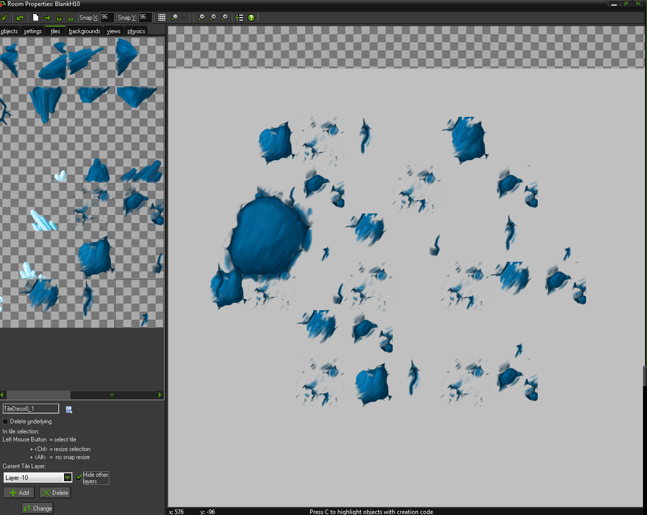
04. Isolated pattern breakers
The more layers, the more Addidas
So far I’ve only showed you two layers or graphics, and I hope you’ll agree that there’s a lot to work with on them. Two layers may be enough for basic attention breaking, but if you want your environments to look really neat and well worked out, they won’t do.
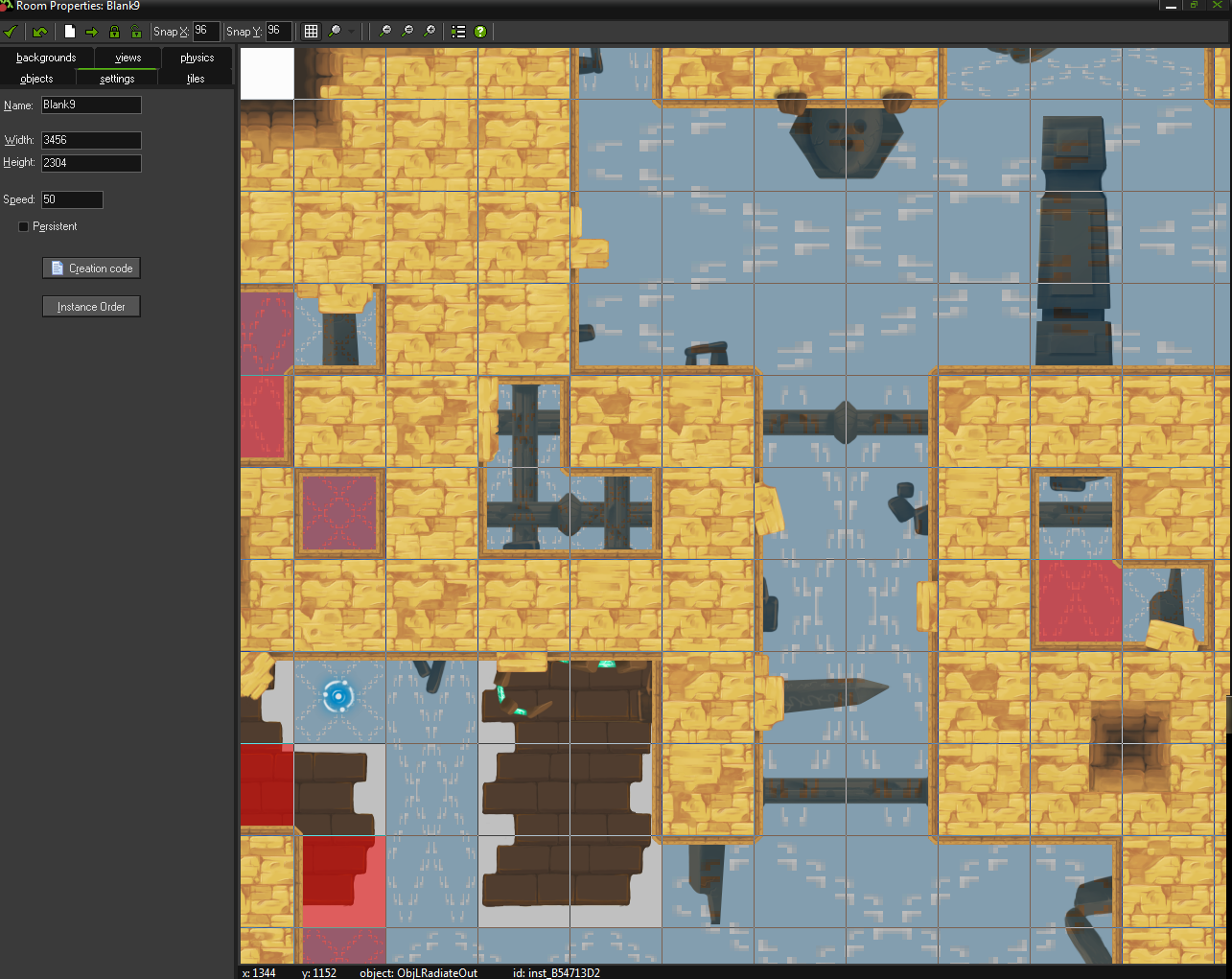
There are about 8 surfaces like these for each environment, some are parts of the background, some of the foreground (depends whether they go over the player or the other elements). But that’s not all. Lighting, live elements or ‘parallaxes’ (layers of graphics that move differently than the player and create a 3D feeling) also contribute to the whole experience. But we’ll talk about that another time.
Now I have to break/tile, and a lot! Let me say goodbye by shouting: “Bring the STIMULANTS!” Because here we work till late night!
